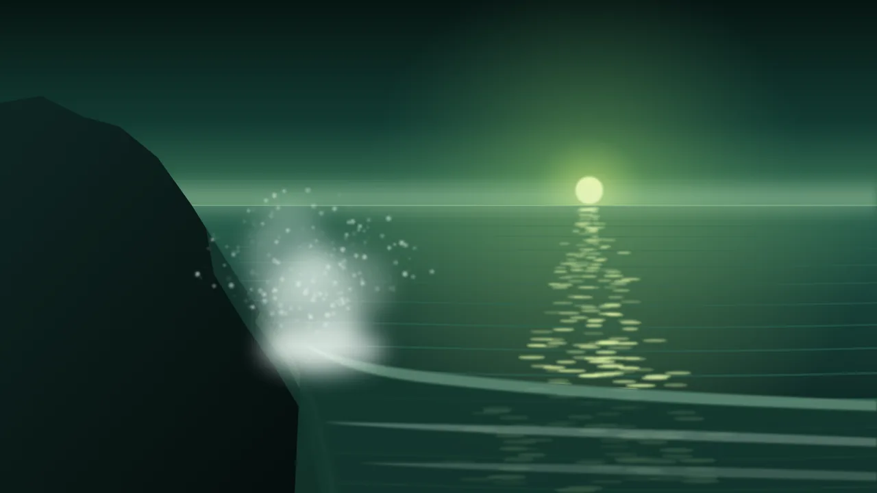
Ask for "a beautiful coastline" and most models hand you the same picture: a turquoise sea, a tidy white wave, golden sand and a horizon that leans a degree or two to one side. Nothing in it is wrong enough to point at, and nothing in it looks like a shore anyone has stood on. A real coast is a set of particular facts: what the water is doing, where the tide is, how wet the rock is, what the air carries off the sea. Name those facts and the picture starts to feel visited.
This post is a field guide, in the order a painter would check a sea: the horizon first, because a tilted one ruins everything else, then the water, the tide, the air, the rock, and last the light that ties them together.
The horizon comes first
People forgive a lot in a landscape, but a sea that tilts reads as a mistake within a second, because water is the one thing everyone knows is flat. Models tilt it for two reasons: a dramatic camera word ("dynamic angle", "dutch angle", "epic") or a strong diagonal elsewhere in the frame, usually a cliff or a wave, that the model lets pull the line with it.
- Say it plainly. "Level horizon", "straight horizon line" and "camera level, tripod at eye height" all help. Put one of them early in the prompt, not at the end.
- Place it. "Horizon in the upper third" for a picture about the shore, "horizon low, in the bottom third" for a picture about the sky. A horizon left unplaced tends to cut the frame in half, which is the weakest choice.
- Take out the words that tilt it. Drop dutch, dynamic and any camera roll. Keep the drama in the weather and the water instead.
- Fix the last degree outside the studio. If a keeper still leans slightly, rotate and crop it in any photo editor. A two-degree turn is a job for an editor, not a reason to re-roll a picture you like.
What the water is doing
"Waves" alone gives you a generic white curl. The sea has a small vocabulary of its own, and each word draws a different picture.
- Glassy. No wind, a mirror surface, long slow reflections. The calmest sea there is.
- Swell. Long, smooth, rounded ridges rolling in from far away, with no white on them. It gives a quiet sea weight and rhythm.
- Chop. Short, steep, messy little waves from a local wind. Add whitecaps, the small white crests, for a fresh, breezy day.
- Spilling breaker. A wave that crumbles gently from the top as it reaches a shallow beach, leaving long bands of foam.
- Plunging breaker. The curling wave that throws its lip forward and closes with a crash, typical of steep shores and reefs. Dramatic, so use one, not ten.
- Backwash. The thin sheet of water sliding back down the sand after a wave, with a lace of foam at its edge. A small word that makes a beach look real.
Where the tide is
The tide decides what the shore shows. High tide brings the water up to the rocks or the sea wall and hides the beach. Low tide uncovers a wide flat of wet sand, rock pools, ribbed ripple marks and seaweed on the exposed rocks. The tide line, a dark band of drying seaweed and shells along the top of the beach, tells the eye where the water was an hour ago. "Falling tide, wet sand reflecting the sky, rock pools in the foreground" gives a picture both a foreground and a time.
What is in the air off the sea
Coastal air carries water, and it carries it in three different ways. Spray is the burst thrown up where a wave hits rock, bright when backlit, a few seconds long. Sea spray haze is the fine salt mist that hangs along a surf beach on a windy day and softens everything down the coast. Sea fog, also called a sea fret or haar, is a low bank that rolls in from the water and swallows the far headlands while the near shore stays clear. That last one is the most useful: it gives a seascape depth in layers, like distant ridges do inland.
Wet rock and dry rock
This is where a render most often gives itself away. Rock that the sea reaches is darker, glossier and greener than rock above it: a wet sheen, dark weed and barnacles near the waterline, then a clean change to pale dry stone above the splash zone. Ask for that band and the shore gains a scale and a logic. Name the stone too, because "dark basalt columns", "pale chalk cliffs" and "rounded granite boulders" are three different coasts.
A rocky headland on a cold morning, level horizon in the upper third, a plunging breaker hitting dark wet basalt on the left and throwing backlit spray, a low sun behind a thin bank of sea fog, a glittering path of light on a grey-green sea, pale dry rock above the splash zone, camera at eye heightA wide sandy bay at low tide under a high overcast sky, horizon low in the frame, long spilling breakers far out, a thin sheet of backwash with a lace of foam in the foreground, ripple marks and shallow rock pools reflecting the pale sky, a dark tide line of seaweed, calm and quietA glassy sea at dusk seen from smooth granite boulders, a long gentle swell with no white water, straight horizon, the last warm light on the rocks and cool blue in the shadows, long exposure, the water silky and softShoreline light
Two light effects belong only to water. The glitter path is the line of sparkling highlights running from the sun or moon toward the camera; it needs a low light source in front of you. Wet-sand reflection turns the beach into a second sky after each wave. For the hour and the colour of the light, the dials in the guide to prompting landscape light apply unchanged; on a coast, backlight is the one to try first, because spray and foam glow when the sun is behind them.
Six ways a seascape goes wrong
- A tilted sea. Add a level horizon and remove dramatic camera words.
- Waves breaking sideways or toward the sea. Say the waves roll in toward the shore, from the horizon to the camera.
- Every wave a perfect curl. Choose one breaker type and let the rest of the sea be swell or chop.
- Rock that is dry right at the waterline. Ask for the wet band and the dry stone above it.
- Foam like whipped cream. Ask for thin lines of foam and backwash instead of thick white surf.
- A postcard turquoise. Name a cooler sea, such as grey-green, slate or dark teal, unless you really want the tropics.
Wide frames and a cheap first pass
A coast is a wide subject, and a wide ratio keeps the horizon long and calm. Nano Banana 2.1 offers very wide frames and lists them on its page; the rest of the catalog shows what each model accepts. Judge the horizon, the tide and the rock on a small first render, since foam detail is the only thing a thumbnail hides, and the price shows on the Generate button before every run.
What a model will not get right
A model draws a sea from pictures of seas, not from wind and depth. It will not keep the waves consistent with a stated wind direction, it will not know how a particular real beach looks at a given tide, and it often places a lighthouse or a cliff that no map would recognise. For a mood piece that is fine. For a real place, start from your own photo and change it with an edit model, and keep the original next to the result.
The coast works well at night too: the night sky post covers moonlight on water, and the twelve weather words add storm cloud and drizzle to any of the prompts above. Then open the studio and start with the headland.
Questions
Why is the horizon in my AI seascape always crooked?
A dramatic camera word or a strong diagonal in the frame pulls it. Ask for a level horizon and an eye-level camera early in the prompt, drop words like dynamic or dutch angle, and straighten the last degree in a photo editor.
How do I make AI waves look less fake?
Use one specific wave word (swell, chop, spilling or plunging breaker) instead of just waves, keep foam thin, and let only one wave be dramatic. Saying that the waves roll toward the shore also helps.
What makes rocks look wet in a render?
Ask for a dark, glossy band near the waterline with weed and barnacles, and pale dry stone above the splash zone. The contrast between the two is what reads as wet.